
FOLLOW FELLOW
A New Self-Journey Experience for Generation Z
In this case study, I'll outline my journey designing the Generation Z-tailored Self-Journey application, from initial concept to the finalized design.
My goal was to create an app to help Gen Z navigate life's challenges and boost their well-being.
Role:
UX/UI Designer
Client:
Follow Fellow
Category:
Application Design
Duration:
3 Month
Year:
2023
Challenge
How to motivate generation Z?
Solution
-
Incentivize user engagement by implementing a rewards system.
-
Personalized feedback and tips based on user input, by using AI technologies.
-
Get instant mentorship advise.


Challenge
Lake of customization and organization.
Solution
-
Allows users to customize their entry pages.
-
Organization and categorization options.


Problem
Get feedback and report for specific dates or periods.
Solution
-
Ability to generate detailed reports and receive meaningful feedback on specific dates or periods of their choice.
Research
Who is the main target user?
While we began our research to identify our target users, we discovered the significance of self-improvement for Generation Z.
We delved deeper to gain a comprehensive understanding of this generation:
-
What are their needs?
-
What sets their unique personalities apart?
-
Why we should focus on this generation?


Key findings

Survey and Interview outcome

Problem statement
"Generation Z needs a personalized app to manage stress, handle emotions, and grow personally. Current resources don't fully meet their diverse needs in today's digital world"
Brainstorming
Time for craziness
During our brainstorming sessions, we set our creativity free and lay all ideas on the table without any limits.

Information architecture
Organizing content

Design
Low-fidelity wireframes
I began with hand-drawn wireframe sketches, fostering a free flow of creativity. After collecting and evaluating these ideas, I worked closely with other UX designer to choose the most promising one, which we then refined into our low-fidelity wireframes.
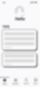


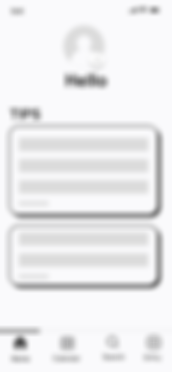
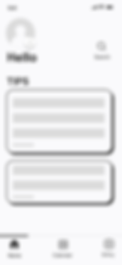
A/B testing
Early testing saves time and effort
I conducted an A/B test to determine the optimal placement for the search button, aiming to minimize inconvenience for users. Here are the results: out of 7 users tested, 1 out of 3 didn't immediately notice the search icon when placed at the top. However, when I relocated the search icon to the toolbar, it ensured effortless access, leading to a smoother user experience.
User interface design
Building the foundation
In the colorful world of design, selecting the right hues is like choosing the right words in a story. For our self-journey app, each color had a role to play.
UI Kit


Component

Illustrations
Changes
Not everything always goes as planed
When I began designing this app, ChatGPT wasn't available yet. But after it launched, I started thinking how I could use this new technology in the app.


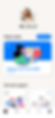
Final design
Turning ideas into reality
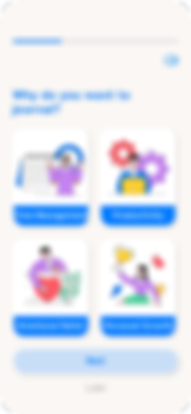
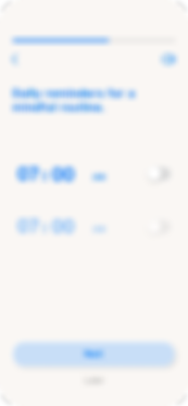
On-Boarding


Takeaway
On this project, I learned how A/B testing in the early stages can save time and money. I also became familiar with Artificial Intelligence technology and how it can help me as a UX designer.